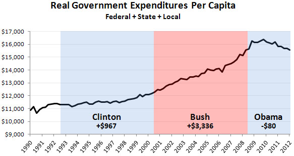
The takeaway, Drum says, is that “total government spending didn’t go up much during the Clinton era, and it’s actually declined during under President Obama. In the last two decades, it’s only gone up significantly during the Bush era, the same era in which taxes were cut dramatically.”
But some said Drum’s chart was a trick, as it looked at total government spending rather than just federal spending. So on Wednesday, he posted a second chart. This one only included federal spending and it didn’t adjust for population growth. The only thing is adjusts for is inflation.
MORE: Think Obama’s a huge spender? Then you need to see these two charts..